

Hey folks! This week’s interview is with Sam Matey-Coste, a climate and energy journalist, environmental scientist and mapmaker. You may have read his brilliant newsletters, The Weekly Anthropocene and Your Daily Dose of Climate Hope. We talk about what cartography teaches you about explaining complicated subjects, how he chooses stories from a flood of climate data and how his newsletter grew from a side project into a writing career.
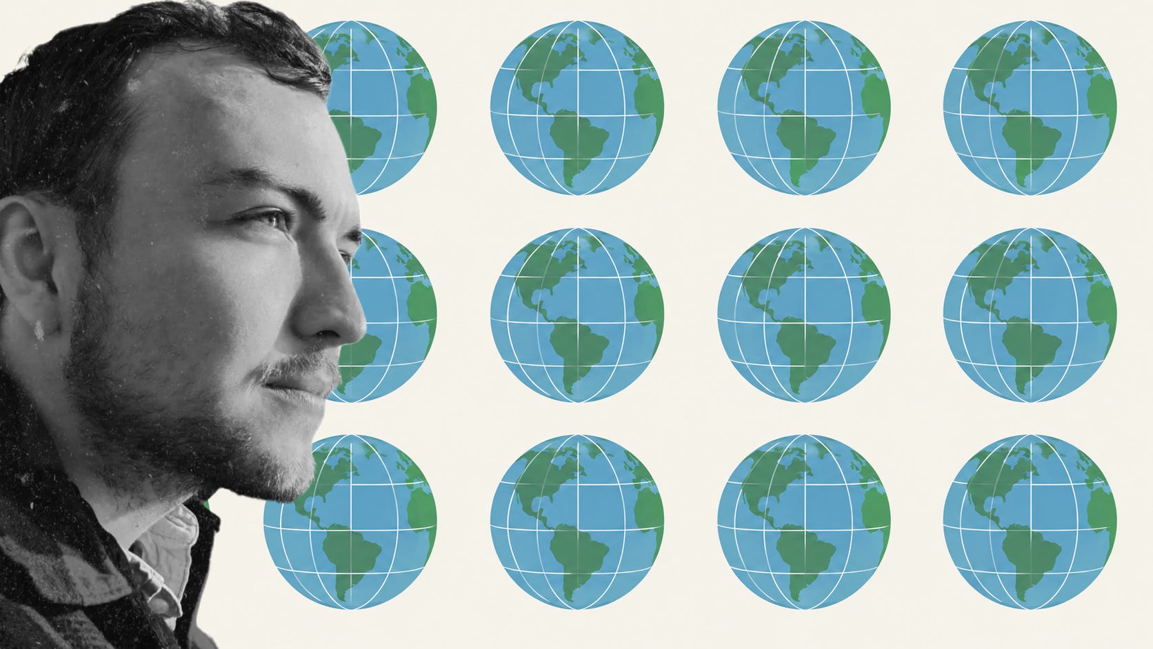
You spent several years making maps professionally. What did cartography teach you about explaining complicated subjects?
I think one really important lesson from cartography is that the onus is on you, the creator, to minimize the possibility of misunderstanding. To try and put yourself in the place of someone encountering this information for the first time and provide people with the basic building blocks of information they need to lead up to understanding what you’re trying to say. Provide context, don’t make assumptions.
Is there something you can show with a map that you cannot explain as effectively in 1,000 words?
If a picture is worth a thousand words, a map is generally worth at least ten thousand words. People just get the message of a well-crafted map right away, really intuitively, in a way that most don’t with writing. There’s a whole bunch of information transfer with maps that happens almost subliminally, with stuff like the color gradient, the background basemap, the projection, the relative size and distance of any points and polygons, even the legend styling, things like that.
Seems like today your main output is writing. Was that a deliberate move away from GIS, or did the newsletter simply become more important?
I never thought I’d be able to afford to spend most of my time writing! I love writing, but I’ve grown up in the 21st century, and it just never looked like a viable career option. I got into GIS because I loved maps as well. I figured my newsletter’s most important career influence would be as a sort of ever-updating resume, advertising my environmental interests and ability to make a commitment to projects. But then, after starting work with Climate Action Now in 2024, my writing hours just grew and grew until it became my more or less full-time job.
Does thinking spatially still affect the way you report stories even when no map appears in the finished piece?
Always! In every weekly news roundup, I try to report on a mix of stories from around the world, ideally (but not always) at least one from Asia, Africa, Europe, and the Americas, for example. When I’m writing a story about a part of the world many people may not be familiar with, I generally try to add a little geographic context in the description.
You often write about large global trends: solar deployment, rewilding, electrification. How do you get from a huge dataset, research paper or map to one story that a reader can understand?
I’m ideally looking for stuff that hits the trifecta of novel, striking, and meaningful, which are really three different things. “Far-Right Politician Says Horrible Thing” is striking, it evokes an emotional response, but it’s not that novel or even meaningful anymore unless it’s linked to action. “This Kitten Can Ride A Unicycle” is novel, the reader is unlikely to have seen it before, and it’s striking, it grabs your attention, but it’s not really meaningful in the grand scheme of things. “Slight Improvement in Photovoltaic Cell Efficiency Reported By Lab” is really extremely meaningful, and I could write a story like that every week, but I think for most people, sadly, it won’t be that striking. And the pace of improvement is so great now that it’s not really novel anymore either.
So, I look for stories on the frontier of the possible, that are novel, striking, and meaningful. That could be anything from a small-scale case study, a tiny project that’s illustrative of bigger issues, or placing big new data updates in context to show the scale of what’s happening.
The Weekly Anthropocene looks for evidence of progress. How do you prevent that selection process from becoming the positive equivalent of doomscrolling?
It depends on what you mean by “the positive equivalent of doomscrolling.” In a certain limited emotional-impact sense, that is exactly what I’m going for: creating curated stories where scrolling through encourages you to feel hope and joy about the future of humanity and our biosphere, not doom.
If you mean “presents a biased picture of the world and inclines people towards unreasonable positivity, like doomscrolling inclines people towards unreasonable negativity, then I suppose I’m counting on the entire rest of the world to counterbalance any excess positivity people might receive from my newsletter. Human psychology tends to accentuate the negative, social media algorithms reinforce that, and external stimuli people encounter in their day-to-day life, like record heatwaves or far-right extremists, can be really depressing.
I’m trying to help counterbalance that negative slant, to show people that fighting for a better world can and does succeed, and that real, tangible progress is being made.
What do you reject? Can you remember a piece of apparently good environmental news that looked convincing at first but fell apart once you examined the data?
I tend to reject anything that could plausibly be brutally over-summarized as “Person(s) Said New Words.” Words are cheap: I should know, I’m in the words business. Even if it’s an encouraging, good-faith news item, like “National Leader Promises Good Thing X” or “Landmark Report Outlines Strategy To Achieve Good Goal Y,” or “Study Suggests We May One Day Build Good Technology Z”, it can easily turn out to be misleading in hindsight. Political winds change, retractions arrive, technologies progress, economies shift. I want to report on stuff that actually changed something in the physical world — animal population up, solar farm built, electric motorcycles deployed — or at the very least legally concrete steps like new legislation or regulations, not promises or quotes.
You now have more than 16,000 subscribers. What actually drove that growth?
Networking. The Substack Recommendations feature, primarily. Incredibly powerful! Several really big-deal Substack writers, notably including Bill McKibben, Dr. Hannah Ritchie, Wayne Hsiung, Jason Pargin, Dr. Katharine Hayhoe, and Drs. Hausfather and Dessler’s joint project The Climate Brink, were kind enough to recommend The Weekly Anthropocene to their readers, often after I interviewed them. According to Substack back-end analytics, the recommendations from those six alone have sent more than two-thirds of my total subscribers my way!
If you were starting again today, would you learn writing, data analysis or mapping first?
I don’t think I could really separate the three. From childhood, I loved poring over my family’s maps and every month’s new issue of National Geographic. I spent so much time flipping through our atlas that the spine disintegrated; it’s still a pile of pages somewhere in my parents’ house. I read all the time, and I’ve always loved books with maps, whether it’s a nonfiction travelogue or a fantasy epic. They’re quite integrated in my mind. I’d do what I have done, which is blend all of them.
Read my other interviews on journalism:
Inside the Cold War newsroom: My interview with Marcus Ferrar
On jargon and the limits of science storytelling: My conversation with Mohamed Elsonbaty
Thanks for reading! If you enjoy the newsletter, share it with a friend or ten. And if you really enjoyed it, consider upgrading to a paid subscription to support my work.
Elia Kabanov is a London-based science writer exploring technology, cities, nature and history (@metkere).