

For years, I was fascinated by data visualisation, but it never became the main part of my work. I sometimes shared infographics on my blogs, and as an editor, I worked with designers and developers on maps and interactive stories. This summer, I started making them myself.
I began with small projects: take a dataset, find an interesting story in it, and show it to the world. These are the first three.
What an eclipse does to solar power
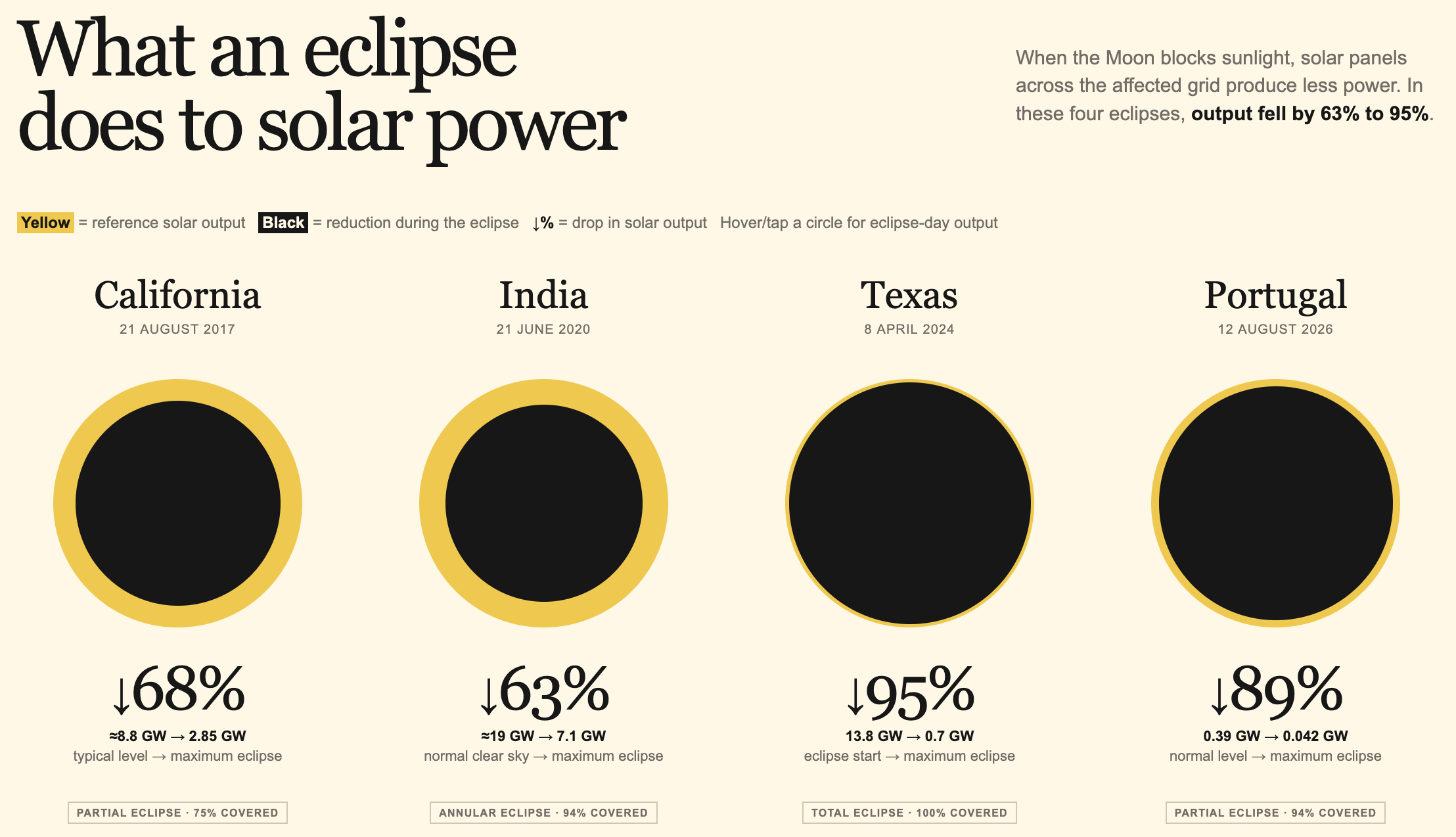
A solar eclipse causes a sudden drop in solar power generation. Sounds obvious, but can we see it in the data? I compared four eclipses to see how big the effect was.
The graphic is based on the eclipse itself: the dark circle shows how much solar output was lost at the peak.
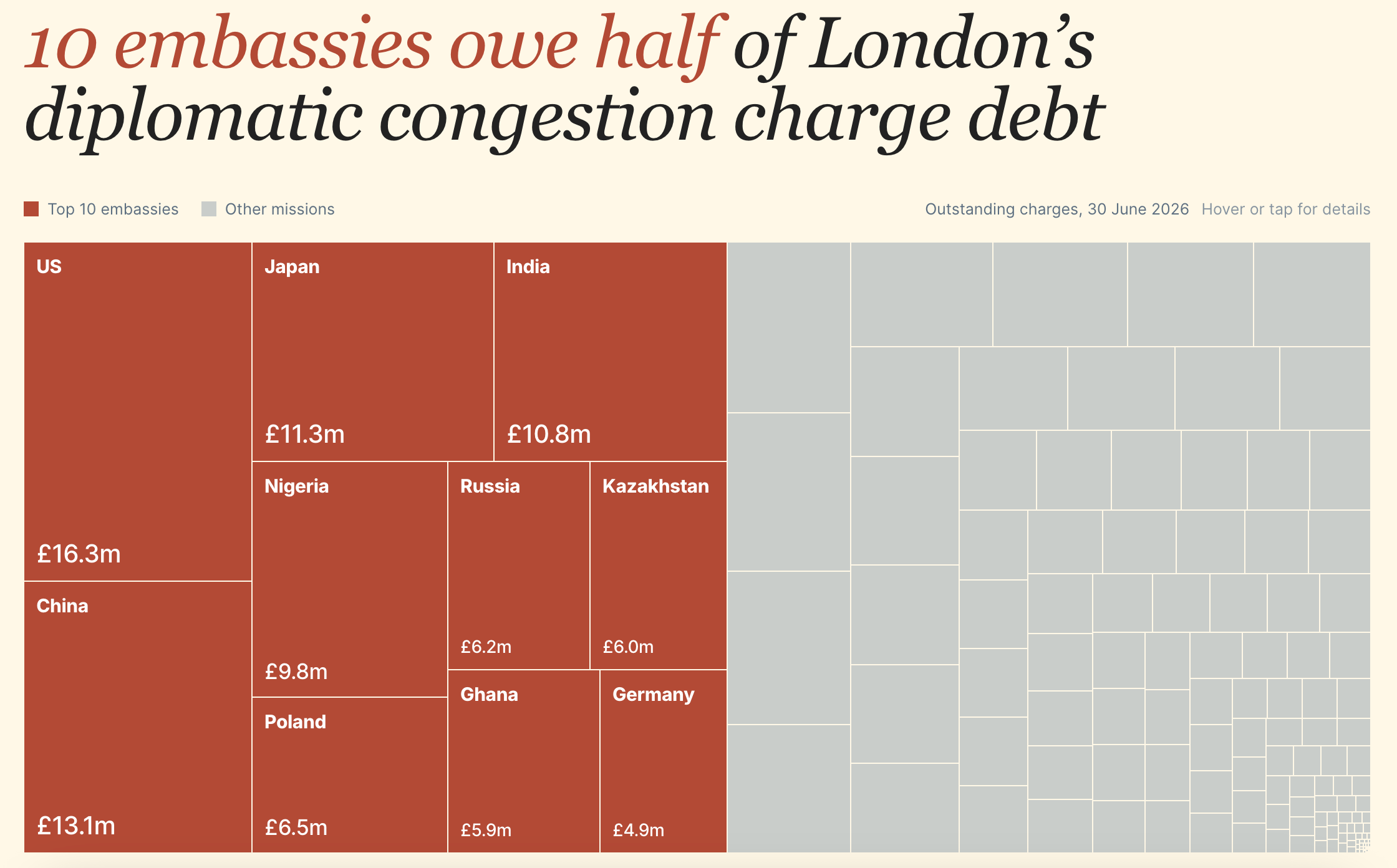
Transport for London publishes data on unpaid Congestion Charges and penalties owed by diplomatic missions. The latest total is £173.8 million. More than half of it is owed by just 10 embassies.
I used a treemap to show how the debt is distributed, then compared the latest figures with the previous year to see which missions added the most debt and which reduced it.
How Russia’s box office changed after 2022
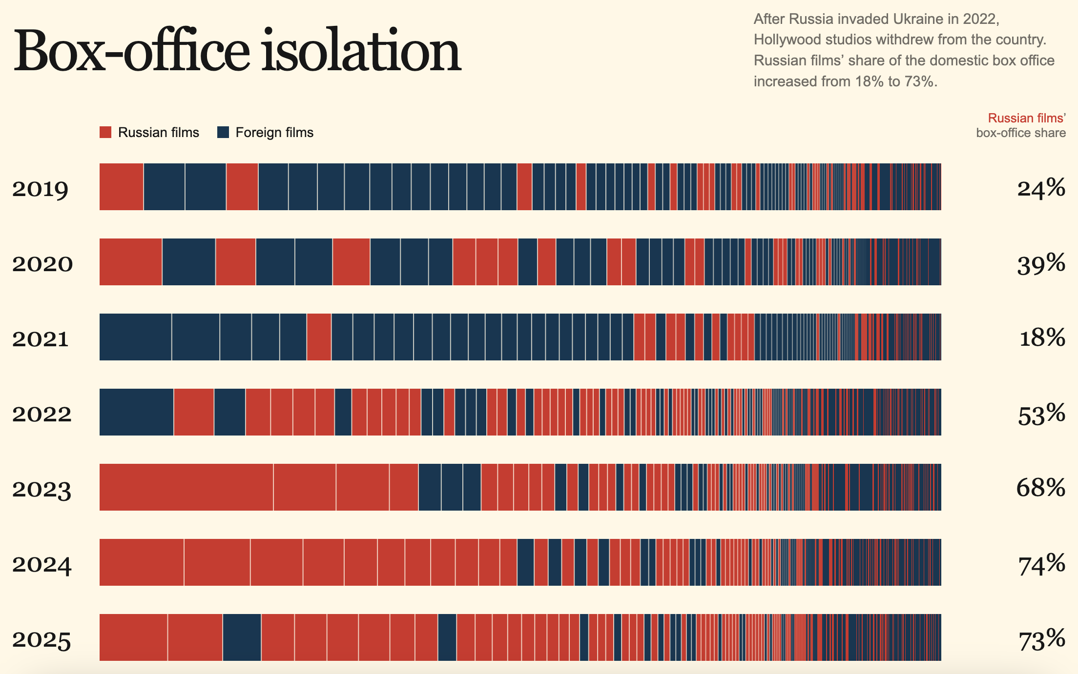
After Russia invaded Ukraine in 2022, Hollywood studios stopped releasing films in the country. The Russian box office changed quickly. I used Kinopoisk data from 2019 to 2025 and represented every film as a strip, with its width showing its share of annual box-office revenue. Russian films made up 18% of the market in 2021. By 2025, their share had reached 73%.
Coincidentally, my first web project, back in 2001, was about movies, and the first texts I published were film reviews. 25 years later, my first proper data visualisation project was about movies too.
What I learned from these projects
Obviously, it’s too early to draw big conclusions, but I’ll try anyway. First, the chart itself is rarely the hard part. Finding data and checking it takes much longer. The box-office project involved combining several sources and verifying hundreds of film titles before there was anything to visualise.
Second, simple ideas work best. The eclipse visualisation is basically four circles. The cinema project is a collection of rectangles. Neither needed a complicated chart type to tell the story.
Finally, making a visualisation changes the way you look at data. As a science writer, I used to think about whether a chart explained the story clearly. Now I ask myself if there’s something in the dataset that words alone won’t show.
I’m still figuring out what works and what doesn’t, so I’d love to hear what you think. Which of these projects works best? What would you change? And if you have an interesting dataset, question or idea that could become a future visualisation, send it my way.
I’m still figuring out what works and what doesn’t, so I’d love to hear what you think. Which of these projects works best? What would you change? And if you have an interesting dataset, question or idea that could become a future visualisation, send it my way.
And that’s it for today. Thanks for reading! If you enjoyed the newsletter, share it with a friend or ten. And if you really enjoyed it, consider upgrading to a paid subscription: it helps support my work and means a lot.
Elia Kabanov is a London-based science writer exploring technology, cities, nature and history (@metkere).
You are superhuman?
I really need to have a disney trip to your brain sir LIKE HOW BEAUTIFULLY YOU PUT THINGS IN PERSPECTIVE